How Winning Web Design Attracts Clients for Law Firms
Web design for law firms is like a storefront showcasing the firm’s attributes and competence. Since first impressions remain powerful, a stagnant or outdated web design may discourage clients from choosing you. It may give the impression that your firm isn’t reliable or trustworthy.
On the other hand, an aesthetically pleasing and attractive web design will likely attract more people to your legal practice, improve your online presence, and inevitably lead to your legal firm’s success.
Moreover, search engines prioritize well-designed websites over outdated ones. This means your law firm may have higher visibility when phrases related to your firm are queried—all because of an exceptional law firm web design.
Let’s dive deeper and discover the secrets to excellent web design for law firms.
Want to skip this length piece? Schedule a call with an expert to find the right law firm web design features for you.
Top Web Design for Law Firms Examples for Inspiration
It is possible to have attractive, stellar designs that keep your clients coming to your website and attract clients.
Here are a few examples of the best law firm web design companies. These websites balanced having professional looks and creating an informative and appealing site.
1. Hagestad Law Group
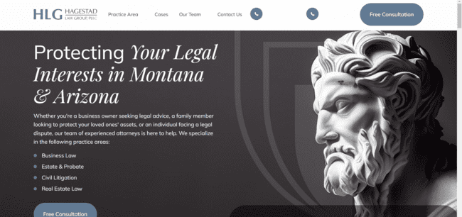
This website has modern aesthetics combined with user-friendly functionalities. It has captivating visuals and gives a positive user-experience.
2. White & Case

In addition to its aesthetically pleasing design, this website allows visitors to find what they need through the search bar quickly. It also has a good navigation bar tailored to meet its audience.

Arnold &Itkin has a very captivating use of animation and images. It also adapts well to any device, despite the complexity of the design.
4. Aharoni Business Law

This site has a simple feel, but it uses appealing headlines, texts, and friendly colors to attract the target audience. It also uses motion pictures that attract business owners (its target audience).
5. Barr & Young Attorneys
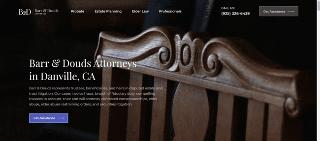
Barr & Young attorney website uses a minimalist design to communicate professionalism and trust. They display the firm’s award and certification, which helps build brand trust and authority.
6. Stracci Law Group
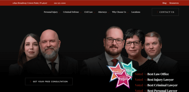
Stracci shows the power of texts in law firm design. The key message on the hero banner and the pictures of the team communicate credibility. Additionally, it has an intuitive navigation bar and adapts to all devices correctly.
7. Robbins Firm
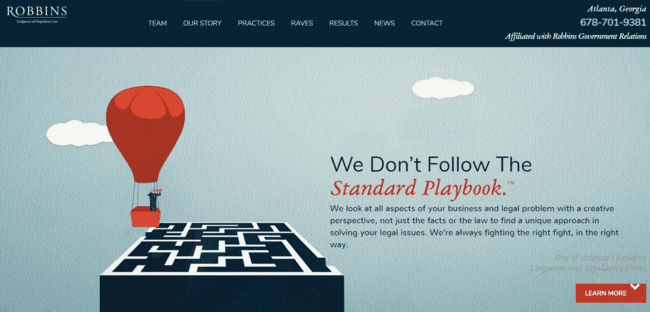
This lawyer website uses moving pictures and animation on its homepage and uses font styles and fonts in capturing the attention of its website visitors.
The design is also minimalistic, yet it conveys the key message of the firm in a clear and attractive manner. It also shows its achievement and contact information from its first page.
Website Design for Law Firm Inspiration
Some of the best law firm websites with exceptional designs have certain visual elements that make them effective. Here are some tips you can learn from them:
1. Use Modern Minimalism for Bold Statements with Clean Lines
Modern minimalism creates a powerful impact on law firm website design. From our examples, typography is a key player in making bold statements. Using bold fonts and styles helps exude confidence and professionalism, that significantly contribute to your brand identity.
Also, go for clean lines and high-quality images to create a well-organized appearance, free from clutter and leave a lasting impression on your audience.
2. Building Trust with Visual Narratives
Visual narratives have proven effective in capturing the audience’s attention from the onset. For law firm web designs, it goes beyond using excellent images, animations, or videos.
The designs must tell a story that resonates with the audience and expresses what your law firm stands for. When used correctly, you can evoke an emotional connection with your website visitors and attract more clients.
3. Seamless Navigation for Effortless Conversions
Simple navigation creates an intuitive, user-friendly website and ensures your audience seamlessly interacts with our website. You can use clear calls to action, organized menus, and mobile-friendly design to create such simplicity.
Moreover, you can also add a search bar to make it even easier for website visitors to find more details on your practice area. This level of simplicity in navigation will increase user engagement, interactions, and conversions from your website.
4. Evoking Trust and Authority through Color Palettes
Colors have a way of evoking emotions and connecting with the audience. Your choice of color palettes on your attorney website design should be strategic and represent your brand identity.
For instance, deep blue and green color schemes convey professionalism and trust. However, dark gray or burgundy are authoritative tones that depict competence.
Whichever color scheme you choose for your landing pages should communicate your brand values and evoke trust from your potential clients.
5. Delightful Details that Drive Engagement
Seemingly unimportant details like the hover effect, animation of text, and micro-interactions can make all the difference in a great law firm website.
When you hover over a button, and it transitions, or if your website has an animation that brings your practice concept to life, it will add a personal touch to your law firm’s website.
These details go beyond aesthetics and enhance your user experience and engagement, making it delightful for your audience.
6. Showcasing Legal Excellence
Your law firm’s website is where you attempt to generate leads and convert prospective clients. One great way to do this is to display your firm’s achievement right from the first page!
Strategically highlight your firm’s awards and achievements on the landing page and add case studies and testimonials to the website design. Doing this will make building trust with your prospective clients and converting qualified leads easier.
Visually Appealing Web Design for Law Firms that Wins Trust
A well-designed website has visual elements that go far beyond aesthetics. It features a clean design layout, high graphic design, and quality content that effectively communicates your legal services.
Image is Everything: Choosing Photos that Speak a Thousand Legal Words
Your choice of image is everything! It can leave a lasting impression on your audience that eventually attracts potential clients or does the opposite.
When choosing your images, it’s essential to emphasize what resonates best with your audience.
For instance, if you have a small law firm that offers business law services, your banner image should relate to the day-to-day activity of a business owner or depict the professionalism required in business.
You can showcase headshots or group pictures of lawyers in your firm to evoke a sense of reliability and transparency.
Moreover, having high-quality images improves your search engine optimization and could give your new website more visibility. Ensure your images communicate your legal services effectively.
Video in Web design for Law Firms: Leveraging the Power of Video Marketing
Video marketing remains a powerful tool in law firm marketing, especially for attracting clients to your website. Effective storytelling through videos allows your law firms to showcase their expertise, share success stories, and provide valuable insights into complex legal matters.
It creates a stronger connection with the audience, instilling confidence and building loyalty, even before your clients meet you. Additionally, since video content is shareable, your audience can easily create a ripple effect.
Professionally share your legal industry achievements, core practice areas, and insights that resonate with your clients through high-quality videos.
Brand Consistency: Keeping Your Legal Outlook Sharp Across All Platforms
Consistency is key! Your design should always align (from logo to color schemes, content tone, fonts, and more) to create a unique and recognizable brand image.
Your brand elements should remain consistent on all our website pages, social media accounts, and more to help instill confidence and reliability in your potential client’s eyes.
The Power of Storytelling: Showing Case Studies that Captivate.
When telling your brand story, testimonials, or case studies, avoid using jargon that is difficult to understand.
Although the legal industry typically has elaborate vocabulary and phrases, you must break it down into clear, understandable terms.
Additionally, your storytelling should always involve real stories that touch on the challenges encountered, the legal victories, and your firm’s achievements and captivate the audience.
The idea is to create a narrative that your firm has qualified lawyers who can offer legal assistance to everyone seeking it.
Need help with your website design? Let your visuals speak volumes and build trust with potential clients.
Defining Your Law firm Website’s Target Audience
You need to pinpoint your target audience to attract new clients and win new cases.
Create a detailed profile of the kind of people you want to help, including their demographics, characteristics, and the problems they experience.
This profile will be like a guide for how your website looks, what you write on, and how easy it is for people to use.
Your Client Personas Vs. your Web Design
Creating a well-detailed client persona allows you to create an excellent web design that connects with the right audience. Begin by researching specific details based on your existing clients.
You can discover their age group, location, and topics in your practice area that interest them the most.
Having this information can aid your custom website, as well as your marketing strategy, in attracting new clients.
Once you know your clients well, use that information to shape the look and feel of your website.
For instance, if your practice focuses on family law, and the age group is mainly 45–60, using minimalistic designs with neutral colors will attract your audience rather than using bright, complicated design colors and templates.
Additionally, the blog posts, landing pages, and case studies on your law firm’s website should directly speak to your client’s persona. The tone of voice, use of vocabulary, and insights should resonate with your client’s personas.
Going Beyond Demographics: Decoding Client Wants and Needs
Knowing your client personas is, however, not sufficient in your design decisions. You must look beyond the basic demographics and discover your clients’ desires.
Instead of relying on only their age and location, you may need to find the motivating factors that impact your client’s behavior.
In other words, you’ll need to understand the specific challenges they experience and their needs whenever they search for a law firm with your service areas.
Doing this allows you to do more than website design— you can enhance your internet marketing and communication strategies to suit your clientele.
Let MyLegalSoftware help you identify your ideal client and design a website that converts new clients. Schedule a consultation!
Designing a Law Firm Website to Attract and Convert Clients Action
Crafting a befitting web design that attracts and conveys clients takes strategy and intentionality. In doing this, you’ll need to focus on these key elements.
First Impressions Matter: Crafting a Captivating Hero Section
Your website’s homepage and hero section are visitors’ first impressions, so every element must capture attention. The hero section may determine how long your visitors spend on your website.
It needs high-quality images, a compelling and attention-grabbing headline, and a concise description of your legal services. Additionally, it should have a clear call to action (CTA), such as Get Started, Learn more, Book a meeting, etc.
It’s vital to focus on conveying your brand identity while using eye-grabbing designs, fonts, and structures.
Content is King (and Queen): Compelling Copy that Converts.
Have you ever heard the phrase, “Content is King”? In website design for law firms, content is king and queen!
The whole point of your audience coming to your website is to get answers to their problems or learn more about a situation.
The quality of your content can improve organic traffic and search engine ranking to improve your conversion rate.
Ensure you use clear, concise and meet the law firm’s SEO requirements to successfully improve your visibility and build brand trust.
Your content needs to showcase your expertise, address your clients’ pain points, educate them with new insight, and have a compelling and attractive tone of voice.
Let’s help you create compelling and attractive law firm web design and content. Get started with MyLegalSoftware.
Mobile Optimization of Web Design for Law firms
Having your firm’s website work seamlessly on every device is essential. Although websites are great on desktops, technology now allows individuals to search on the go.
Designing a Website that Fits for Any Device
With the number of people using mobile devices, desktops, and other smart devices, you must ensure your website fits seamlessly into any screen. In other words, your website needs great mobile responsiveness and be mobile-friendly.
Responsive design is the key – it helps your content adjust and change, making it simple for anyone on any device to find what they need without any problems.
It’s about ensuring everyone has a good experience when they visit your website, no matter what device they use.
Making Sure Your Law Firm Website Loads Like Lightning
A fast website is a happy website! Your site speed ensures visitors get access to information on your site as quickly as possible.
Having a fast website prevents your users from getting frustrated and leaving without viewing your information. Moreover, speedy websites can help you rank better on search engine result pages (SERPs).
To ensure your website loads as fast as possible, consider using smaller image sizes and clever page loading strategies from a web designer agency. Doing this will help enhance your user experience and boost your credibility.
Web Design for Law Firms: A Seamless Mobile Experience
In creating a seamless mobile experience for your audience, consider doing the following:
- Keep buttons and texts big enough for easy tapping on mobile screens.
- Make forms simple and quick to fill out on smaller screens.
- Choose clear fonts and colors for readability.
- Streamline the navigation to avoid confusion.
- Use images wisely and ensure they don’t slow down your firm’s website.
- Prioritize essential information and minimize unnecessary, long content.
- Test your website on different mobile devices to find and resolve possible issues.
Legal web design companies like MyLegalSoftware can help you create the user experience your website needs! Book a free audit here.
Tracking Your Website’s Success
On attorney websites, tracking analytics is essential for continuous results. These analytics show where you currently stand in visibility to your audience and help you make smarter decisions in your law firm marketing.
Data in Web Design for Law Firms: Understanding Key Website Metrics
Understanding metrics like traffic, conversions, and engagement helps your firm’s growth.
Traffic metrics show how many people visit the site, conversions measure desired actions like inquiries, and engagement gauges how much time visitors spend.
Interpreting these metrics will enable your modern law firm to make appropriate changes and stand out. Ensure you look for metrics such as traffic source, bounce rate, conversion rate, average session duration, etc.
A/B Testing in Law Firm Web Design: Experimenting for Optimal Results
Whether it’s changing colors, buttons, or text, A/B testing allows you to test the waters and discover what resonates most with your audience.
It’s a strategic way to optimize your website to get better results, and you provide a better user experience to your visitors.
Keeping Your Law Firm Website Design Ahead of the Curve
Website design trends change every so often. To stay ahead of the competition, you’ll need to stay abreast of new trends and regularly update your website. Continuous maintenance ensures your website remains modern, user-friendly, and aligned with current trends.
Become a data-driven lawyer and ensure your website is always working for you. Schedule a consultation today!
Key Takeaways
- Create a client persona and use it to guide your design elements to resonate with the specific needs and preferences of the target audience.
- Maintaining consistency, from logos to fonts and content tone, is essential for developing a recognizable and trustworthy brand image.
- Have compelling stories that captivate and resonate with potential clients on your website.
- Ensure your designs are mobile-friendly, responsive, and adaptable to various devices for an enhanced user experience.
- Pay attention to SEO when drafting to help increase your online visibility.
- Use MyLegalSoftware to get a custom web design that attracts more customers. Schedule a call today!
Frequently Asked Questions on Web Design for Law Firms
Here are some frequently asked questions:
1. What is the best website builder for law firms?
It largely depends on the specific needs of the firm. However, WordPress, Wix, and Squarespace are popular choices.
2. What should a law firm website contain?
It should contain an attractive image/video, contact details, essential information like practice areas, testimonials, attorney profiles, and informative content.
3. How much does a good law firm website cost?
A law firm website design cost typically depends on the type of site, its features, and its complexity. However, Mylegalsoftware offers affordable lawyer website designs for small and large firms.
4. What are the most important SEO tips for law firms?
Conduct keyword research and use the relevant keywords in your website content. Also, ensure your website is mobile-friendly and loads speedily on every device.
5. Should I use video marketing for my law firm’s website?
Yes. Video marketing can improve the quality of your web design by giving it an appealing and personalized look and feel.
6. Can I design my own law firm website without professional help?
Yes, it is possible to design your own website. However, having a professional agency handle your website design will ensure your site is SEO-optimized and reaches its full potential in visibility and impact.
7. What are the biggest mistakes law firms make with their websites?
Common mistakes law firms make include neglecting mobile optimization and using outdated and unappealing content and images.


